After I had chosen the project title of manhood I can start to look at different visual starting points. To begin with I am using a list of 50 things every man should own which I found from a website on Pinterest. I gathered these items and have started some visual studies from it.
This was my first visual study of my watch which I did in pencil and I added the tone and detail of the watch in also. This drawing was inspired by Bodor Tivadar and his style of line drawings I used him as a reference because I believe that he uses his tone and shading really well which is why i chose to use this style as it fits the design principle really well.
I think that the final drawing worked really well because I think that I have captured the shape and detail of the watch which I think has worked quite well. I think that the only thing I could improve on would be to make the drawing 3D because I have drawn the image as a flat 2D image. As well as this I think that I can manipulate this drawing more in the future as I think that the patterning on the strap is really nice and compliments the detail of the watch well and would look even better in colour.


I also completed two more men scratchy drawings of the watch to compliment the fine detail that I put into the pencil drawing. These brio sketches aren’t of very good standard because the shape of the watch and the details inside of the watch aren’t the same as they are supposed to be. As well as this the lack of tone in the sketch means that there isn’t really a lot of emphasis in the drawing. To improve these drawings I think that I need to be looking more at some different illustration styles because I think that this style of working in quite a scratchy style doesn’t benefit the item much and I think that it would benefit from more of a blocked and patchy style or a tonal style.

I also attempted a mono print for the watch in a black ink on an envelope. I chose the envelope because I think that it would help blend in with the patterning on for example the strap where the leather works really well and creates some nice patterning. However in this print I have pushed down too hard when trying to replicate the patterning and watch face and as a result has meant that that area has blacked out and has left none of the detail visible which ruins the outcome of the piece.

Quick sketch of the pipe
I have again used fine liner pen to do a visual drawing of the visual items I have been drawing from. I have drawn the pipe twice but one bigger than the other to try and get the shape better. In this design I looked at the shape more than the detail in the pipe. This study is again quite boring and not very expressive and therefore I will need to look more at different illustrators because the design style isn’t looking very good at the moment.
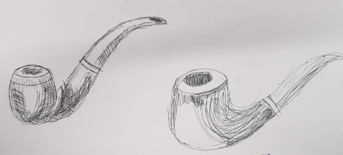
Watercolour study of pipe
I have looked at using watercolour in this study because there isn’t any colour studies yet and I think that through looking at Rene Magritte’s study of Ceci n’est pas une pipe or this is not a pipe has inspired me to look in more detail at shade and colour. I decided to use watercolour unlike Magritte who used oil on canvas because I think that I could manipulate the colours better and with more direction as I look at the colours and shades. The final product hasn’t worked as well as I wanted it to because the water colour has leaked and made more of a stained look which doesn’t capture the true colours and shading which I hoped for. I do however think that I have captured the colours well in a light and where the light hits the smoothed plastic I have included the mirroring of this light. The outline of the drawing I don’t think is very neat as it was hard to control the line with the watercolour.


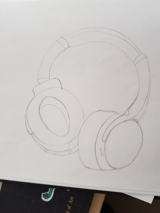
Headphones studies
The first drawing was a simple line pencil study which doesn’t poses any detail at all only the shape size and proportion of the headphones which I think I have captured really well and has got a lot of from and rhythm. To improve this design I need to look more at adding shading and detail which I am going to improve in the next designs.
I have used Jessine Hein as inspiration for this simple line drawing. Her work in some ways is really interesting as she captures form really effectively and I believe it works for her style of work but is quite ineffective with the items I am looking at.

I then looked at improving this design and added some biro pen to the previous study to give the image more value and pattern. I did in the end use too much pen in places and not enough in others. I needed to improve my design by having more use of line as it is all quite scribbly and if I was to look at the line more I think that it will bring some of the different elements together to make the image more balanced.

I did return to this study as I used sharpie to improve the line work. I have in this design however looked at making the lines bolder and more compelling because they’re quite faint and simplistic in my other drawings and so I needed to look more at the different types of line and vary the illustration styles. in this study I have used Terry Wylde who is a pop artist and creates really interesting study’s mostly portraits and I believe that I have tried to replicate this style.This study did look a lot better and more like a pop art study with the boldness of the line. I really like how I have used the sharpie and the thick coloured in lines to build up the texture of the headphones. I think that I could improve this design by using a different background and build up the image on top of that because I think it does looks quite bare and it takes away from the emphasis on the bold design.


Biro pen study of razer and shaving gel on ripped coloured card
I have used ripped up pieces of different coloured card to build up the background of the study because I haven’t done many study’s with a background and therefore I have decided to build up more of a complete image as I have learned that the images look quite bare if there isn’t a lot of detail in the drawings as a result I have started to look at adding a background. The final outcome of the Biro on top of the card has worked really well because I think that the contrast between the colours of card themselves are really interesting because of how the card is ripped and placed it left quite a nice repeat pattern. This combined with the value of the biro drawing creates a real emphasis on the image. I think that the shaving foam sketch is of a lesser quality than the razer one because there is more detail in the razer to include making it a more detailed drawing.


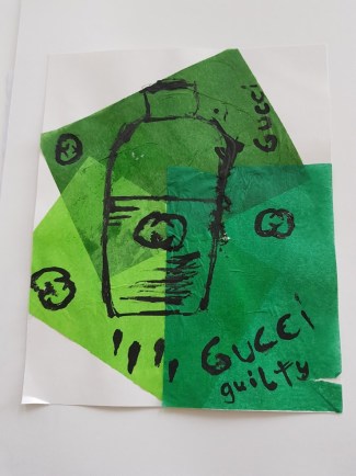
Dip pen ink drawing
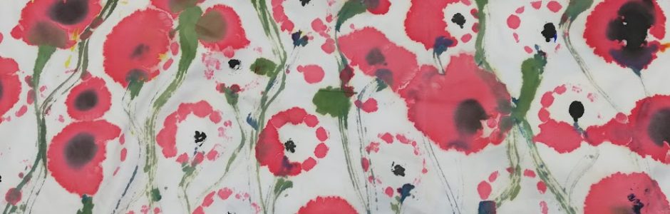
This quick sketch is a layered image as I have used different shades of green, because the cologne bottle is made up of greens. I then layered them on top of each other from darkest to lightest this provided interesting results as the darker colours did come through onto the lighter colours where it was layered which created movement as the pieces were layered in a spiralling motion which created the movement. I then proceeded to use a stick which had been snapped to a point and used it as a pen as I used dipping ink to draw the cologne bottle which was another item on the 50 things every man should own. I think that the drawings themselves are very basic because it was quite difficult to use the ink neatly with the stick. The final outcome was quite textured with the rippled areas of paper and created a nice messy line.
Tivadar.B (no date) line drawings. Available at https://www.shutterstock.com/image-vector/pocket-watch-illustration-drawing-engraving-ink 1214720446 Accessed 1.04.19
Magritte.R (1929) Ceci n’est pas une pipe. Available at https://www.renemagritte.org/the-treachery-of-images.jsp Accessed 1.04.19
Hein.J (no date) Some of her line work . Available at https://www.illustrationweb.com/artists/JessineHein/view Accessed 1.04.19
Wylde.T (no date) Pop art work. Available at https://www.google.com/search?q=terry+wylde+pop+artist&rlz=1C1GCEA_enGB840GB840&source=lnms&tbm=isch&sa=X&ved=0ahUKEwib3LCt6sfhAhXCoXEKHayEBiAQ_AUIDigB&biw=725&bih=752#imgrc=q5ZTA88RNCMCpM: Accessed 1.04.19
