https://www.disegnodaily.com/article/gendered-objects
I have found this article which talks about there being in society still gendered objects. There is lots of objects which you would associate with a man these being things such as tools cars and heavy items which a strong man should be able to use. I have looked at these items throughout the week and have illustrated them in different styles, these i can use later in the project in my pattern designs and can show the typical view of man with the gendered objects and the new 21st century man.
Belt watercolour
I have started to look at some more colour studies as Surface pattern has a main briefing point of colour schemes and therefore I need to make sure I have got a wide variety of colour work in my visual studies which I can take forward into the design process later on. Another one of the products on the 50 things every man should own was a leather belt. I decided to use watercolour as previously with the pipe and it captured the colour scheme a lot better than I think any other technique could. This is because the colours have got quite a strong richness to them when layered and create a nice emphasis around the image. I then added some detail with the markings in biro which I think did work but I think that once the colours had dried the biro did stand out quite a lot and didn’t suit the browns of the belt. I think that I should have used a brown colour to blend it much better.

I also did a pencil sketch of the belt getting the tonal colourings effectively. I really wanted to capture the texture and strong detail in the belt. The patterning on the belt with of the eagles and the fine detail in each individual motif. I put the paper on-top of the belt and forcefully pushed on with a 5B pencil to capture the detail and its form. Using the darker pencil worked much better than a lighter one with less graphite because you had to press on harder to get a result and then the consistency had to be even or else you got marks and singular lines which didn’t suit the etching style. I think this technique captured the design and patterning really well and the line and tone of this piece suited perfectly with each-other. However I think that with there being raised edges that I couldn’t capture fully all of the detail and I couldn’t move the paper around as I would lose where the design was.

Quick pencil outline sketches of cars
I started to look at the industries which typically you would find a male in based on some research I have done into the theme and traditional men’s roles. I found that a lot of hands on fixing things such as a mechanic, plumber, electrician or joiner typical physical hands on job. With looking at a mechanics I thought that I obviously had to look at cars so I grabbed an image of google and did a quick outline sketch to capture the form and then could manipulate it later. These sketches weren’t anything special but did capture the line and some detail of the aerodynamics and shaped design. I am going to work into these more once I decide a media to work in.
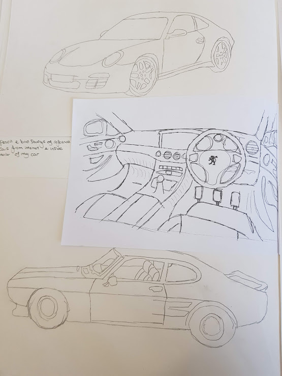
I also took some photos of the interior of my car as it is one of the original potential outcomes which I wanted to explore. I took some photos of the car and the interior and I then did a quick interior sketch of this as well as I could maybe look at putting a design onto it in the future if it’s something I did choose to look at. This sketch was rather scratchy and rough but I think it contrasts nicely on the page with the block fine line cars.
I wanted to do something with the cars and the basic outline and so I decided to start to look at some collage. I wanted to design 2 contrasting cars one with very untypical male colours such as pinks yellows and general bright vibrant colours. I used magazines and newspaper in my collage because they often have quite a glossy finish to them which will add that extra bit of vibrancy and works well with the contrasting colours. I have used Giles Davies as my inspiration for this piece. He specialises in collage but his work I really like because he creates life like pictures using the collage of the same items I used. Giles likes to use more in detail pieces of work which from a far look just like a photograph and is only when you look into it you see that it is actually just collaged magazines and pieces of paper. My collage attempt didn’t work as well as I wanted it to because I needed to add more of a realistic approach and so I should of used colours which would of been found on a car but the style i was going for was breaking the stereotype and so I couldn’t use a realistic approach.


Pencil sketches of tools
These were some very basic quick pencil sketches of some tools I brought in based on the questionnaire research I got. I have used Claes Oldenburg and his drawings of everyday items as inspiration for these drawings as he uses quite basic lines and with some nice washes of colour in the background. His style is very similar to mine as his line work is quite basic as well but gets the shading in his images which work really well when contrasted against the colour wash background. I have used a basic HB pencil in this piece which I decided to use because I think that I will need to possibly use these drawings later in the project on Photoshop and illustrator and so I will need something which I will need quite a basic design to be able to work into later. I took some photos of the items I would be looking at as I would then be able to refer to the image as I reflect next to the attempt. I have used some very basic line work in these pieces. I have tried to add some detail and texture into the drawings but I was using half the primary item and then also the image I took on the computer screen which didn’t help me capture the pieces in their true form.


I then used these sketches as a base for me to add some acrylic paint on top of. I found quite quickly that the normal printer paper doesn’t help when using acrylic or any form of wet paint as it is very thin and can rip the page quite easily. I think that I have got the colour schemes right with the screwdriver and wrench however the plyers were really difficult to capture as there was a lot of different colours in the image which needed mixing and so I didn’t capture that particular image correctly. As well as this with the wrench I believe that I haven’t captured the form and shape as well as I could of because it is quite slanted and wobbly meaning which is fairly obvious when looking at the image from the angle I have painted it. I think that next time I will spend more time on mixing the colours to get it right as this is what makes the image as successful and gives it its attractiveness. As well as this the form and shape of the image is vital to the study looking how it is supposed to with the shading and textures.


Dip pen ink drawings
After my chat with Anne-Lise she showed me an article about James bond (Daniel Craig) carrying his child in a sling which caused outrage and debate on the internet because in the movies he is painted to be a big strong alpha male and through carrying his child in a sling this emasculates him and tears apart his self-made image. I wanted to look at this in more detail as I think that it ties in with the modern male picture so much and how a male is perceived to be or supposed to act and the activities which are permitted and those which caring for your child obviously isn’t. I thought that I had to start to look at this as it was such a big deal and it fits the breaking the stereotype which my proposal said I was going to do. I wanted to explore the dip pen ink technique again as I think that it didn’t work as good as a I wanted it to last time with the cologne bottle so I wanted to look at it again. I used the photo of him carrying his child and did a basic outline sketch of him with the stick and then added some text around it with some quotes from people like @piersmorgan on twitter “#emasculatedbond #papapose”. The final outcome was in a way what I was looking for as I captured the basic outline of him with his child quite effectively however I don’t think that it is a true reflection of his body shape which is important for an outline image. The thing that I am happy with is how it looks with the size and quite sketchy outline. I think that it would be interesting to see how this technique would work on a big scale on A2 size with a dark background as it would contrast quite effectively against the black or coloured background.


Block printing
I really enjoyed block printing the last time that I did it and as I have started getting a lot of words which are building up around the theme manhood and what it meant to be and what it means to be a man now. I started with the technique I knew before with acrylic paint printing face down and this was leaving a lot of blank and missing bits on the prints and was leaving big clumps of paint on the page which takes a while to dry and wasn’t leaving a professional look to the prints.


Bernie helped me out with the prints and showed me a technique with printing inks where your rub the paper onto the ink and this lets the ink soak more evenly into the card and doesn’t leave blobs of paint on the paper. If you got the amount of ink right on the page then you got a really professional looking print. I started to then play around with the words after a few tests. I got some interesting result with colour combinations and I think that these tests I could play around with on Photoshop and could layer to get some interesting results.


I think that there is still alot of things which I need to explore still to cover all of the bases for my visual studies.
