By the start of this week I had got my questionnaire results back. I gave my questionnaire to different age ranges to get a consensus and range of results which will provide me with lots of views and values of what they think it means to be a man. These results I needed to inform my project because this will give me hopefully various visual starting points for things to document and draw. As well as this the views on different things such as talking about problems will contrast the further back the age range goes.
I did get a wide range of views with what I had hoped for. I started by looking at some of the items which you would stereotypically associate with a man as these items give me a base for a stereotypical man and I can use these later in the project when creating various pattern designs. A main item that popped up on most questionnaire results was the use of tools as these are very much so something that a man is associated with and ties in with the job roles also which I will look at in more detail later. I had already looked at colour studies of some tools last week using acrylic and pencil but I found that some of the detail which you can get when using black and white is really effective and contrasts well.
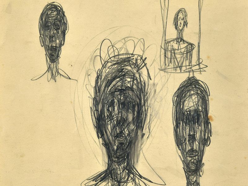
Giacometti. (1947) some of his charcoal work. Available at https://www.smithsonianmag.com/smart-news/two-lost-alberto-giacometti-drawings-found-antique-dealers-collection-180964472/ Accessed 29.03.19
I was influenced by Giacometti in this piece as he uses pens and black crayons in his work. I found that you can achieve a similar result with a charcoal pencil and putty rubber as you get the outline of the shape you’re trying to achieve. As well as this the tones which you can create when smudging the charcoal pencil creates quite an authentic look and is similar to Giacometti’s work.
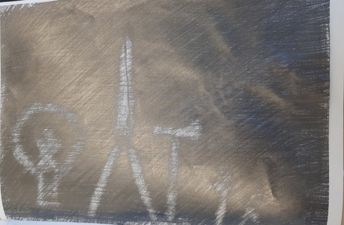
I continued to look at the effects which the contrasting black and white from the dark charcoal and where the putty rubber had had an influence in creating the light shade. Celia had got some interesting light bulbs which were fairly old and so had some interesting line inside of the bulb. I decided to use a dark 8b pencil as this would create the same dark effect hopefully as the charcoal pencil. In this piece I was trying to capture the shape and shading with using pencils. I think that the final outcome of this piece creates an interesting composition. I think that as a test this image has come out as what looks like a simple drawn image and I don’t think that it stands out very much with the lines being rather messy and I think that the shading needs to be worked into more as you can see all of the singular line marks which doesn’t help the image blend as one. This piece could be used in the future possibly once worked into but I don’t think as a standalone image it does itself any justice.

A2 charcoal drawing
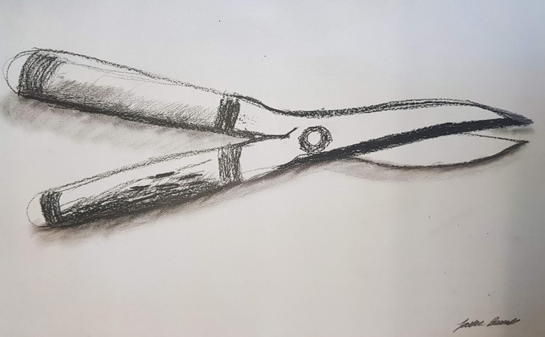
I really liked the colour contrasts which the charcoal and dark pencils were giving me and so I wanted to continue to look at this style but on a bigger scale as I think that the bigger the scale the more effect and detail you can get into the image. I was continuing to look at tools in this piece and had found some shears to illustrate. I think that I have captured the form quite nicely in this image and the parts to the image where shading has been used it has worked quite effectively. I think that the shading in this image is the emphasis and this also makes the image look more 3d especially with some of the darker more defined lines as this gives it more form. I think that working large scale benefits the detail more with the colours and I will use the larger scale in the future as I think it makes the image much more defined.
Continuing with the charcoal and black contrasting colours I have looked at Jim Dine and his drawings as inspiration. Dine creates pieces which look quite messy and uses charcoal and adds a lot of smudges on the paper which I think add to the final outcome. He works with watercolour mainly in his pieces which give him the really dark colours which I have tried to replicate by using charcoal. In Dine’s work he also looks at tools which I makes him a good artist to be inspired by. I have used the tools which I had to hand and have worked based on the inspiration from him.

Dine.J (1960) Jim dines tools drawings. Available at http://jcsm.auburn.edu/collection-spotlight-jim-dine/ Accessed 29.03.19
I have again worked A2 size as from my last test I think that it gives me much more control over the form of the shapes. I have used similar scratchy pencil markings in my work to try and make my work have the same kind of shading and smudges which he shows in his work. I found it quite difficult to add the dark colours to the tools as I have used different tools there isn’t the same volume of space which I can add the really dark colours to. I did add some smudging to this piece which added an emphasis to the piece. I think that the darker lines again made the form what it is and creates movement around the piece with the emphasis being put strongly onto the darker parts of the piece. I think that I can use this piece in the future with the shapes as i can manipulate the colours in Photoshop and the shapes more.

I gathered some more screwdrivers and looked again at working with charcoal the result this time however is much more effective as I used the charcoal pencil first to get the form and then added a charcoal crayon on top of that to greater the contrast. I think that the form had decreased and the colour experimentation has taken over more. I think that the detail in the handles on the screwdrivers when the charcoal is added takes the emphasis for the whole image and is the first thing you see.

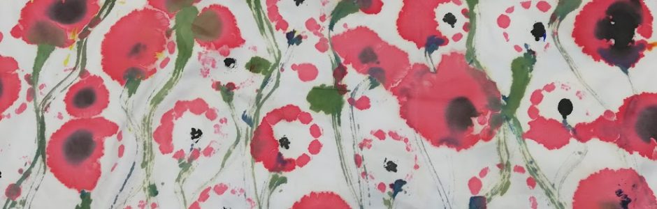
I wanted to start looking at some more printing and transfer techniques. I used some of my previous drawings and did some tests. I looked first at emulsion transfer onto a cotton to see how this would work. I think that the outcome of this piece was interesting because it was hard to get all of the paper of without scratching of the colour image. I think that the colours were quite stripped back also. As well as this where you apply the emulsion paint that stays on top of the fabric therefore I don’t think I will use this particular technique in my outcome. I then applied the same emulsion transfer to some coloured fabric to see if there was any difference in how it looked once printed. I found that there was a slight increase in looks as the colour background did come through the emulsion paint slightly and around the image created movement between the images transferred onto. I think that with that particular image with it being the spanner and there being similar colours in the fabric. I think that with the background there needs to be contrasting colours or some fabric which isn’t to bright as it will take away from the image but it’s quite blocked out by the emulsion paint wash. I think that I could possibly use this technique in the future when creating my surface patterns because when in harmony with a colourful but darkened background the transferred image becomes the emphasis.


fabric dying of emulsion transfer
After my one 2 one with Anne-lise she told me about Robert Rauschenberg and his collaged screen prints. Rauschenberg’s work is a collection of images which have each been screen printed and applied then given washes of colour on top of the images. I really like the way these images have been printed with a half tone pattern on top and this is a technique which I really want to look at and see if I can use this in my work.
Through looking at Rauschenberg’s work I wanted to do some tests to try and see how I can work in the same style but I haven’t got the resources yet to get a screen made for a screen print.

Rauschenburg.R (1964) Screen printing of moon landing. Available at https://www.tate.org.uk/whats-on/tate-modern/exhibition/robert-rauschenberg Accessed 29.03.19
I started by looking at dying the fabric which I had emulsion transferred to see if I could achieve a similar result. I found that with not having the proper dying powder I used brusho, this didn’t work as well as I wanted it to as the fabric didn’t take to well to the emulsion paint and left some of the areas darker than others. As well as this it took a long time to transfer and rub the paper of and this doesn’t always leave all of the transfer on.


Cellotape transfer tests
I then started to look at some more transfer techniques and cello tape transfer could be one which I thought could work with as there is a clear background with the transferred image ontop. I think that this technique worked well for some reasons. The colour schemes which I have used work really well with the image as they contrast well on-top of each other and this really benefits the half tone pattern. However it was quite hard to layer the sello tape ontop of the image without it creasing which eventually once dried shows up and I think that with me using tissue paper that also crinkles and overall it does look quite messy. I think that overall this technique has worked well because I have managed to layer the colour and the half tone pattern effectively and there is a variety of colours which I can use if I wanted to use this in a pattern in the future.


.
