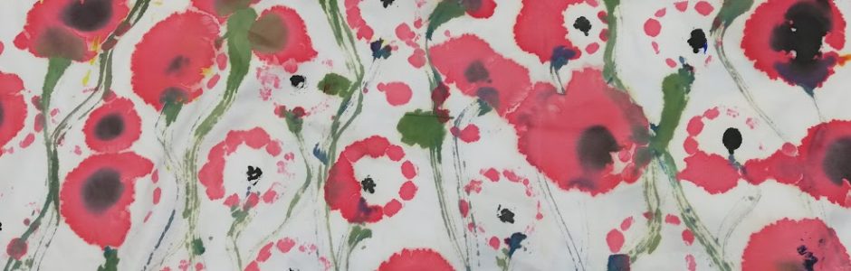
colour washes over me
I have been exploring different ways in which I can add the colour washes to the half tone pattern images which I want to create a Robert Rauchenburg inspired collage. I have already attempted dying the fabric and using brusho so I wanted to see what watercolour and acrylic paint would do to an image possessing the half tone filter. These were the results.


I think that it has worked to a certain extent as I have managed to get a lot of the colour into the image successfully however I think that with using such bold pure colours that it does take away from the image itself and this isn’t what I was hoping to achieve when I was testing the technique. I think that this technique overall hasn’t again given me the colours which I intended. I do think that I will need to create a screen with Chris to create the collage.
outiline work of daniel craig
I have applied the half tone pattern to the photo of Daniel Craig as a test of the technique. With the half tone patterns you can play around with the contrast in colours, as it makes the image black and white, and the size of the dots. I have found with the tests on previous images that the larger dots look a lot better and creates more emphasis in the image. I also think that with the dots being bigger the contrast in colours is more evident and this creates movement around the image as there is more light and dark to be admiring.

I have looked at Alexey Bogolepov and his line work as started by looking at Alexey Bogolepov. He uses photography which he then manipulates by adding colour to the framework of the image to show the values and shape of the building. This style of work is really effective because of the contrast in colours which is provided by the original image being in black and white. Bogolepov uses a simple use of line in his work and these lines are simple straight lines which doesn’t over complicate the image but is still really powerful.
Bogolepov. Alexey (no date) his photographic work.Available at https://www.pinterest.co.uk/pin/547961479659994414/?lp=true Accessed 3.04.19
I have used his work as inspiration for this work on the Daniel Craig photo. I have been looking at this technique because when you take away the original image it creates a really nice composition. Once i had traced around the image on photoshop i started looking at colour ways which would suit the background colours. I think that with it being a black and white image with greys also in the mix, the colours needed to be bright and bold. I looked at red as it stood out the most out of all of them but it didnt look right on its own. I started playing around with multiplying the traced image to start making surface patterns as we are getting closer to developing design ideas. I think that the contrasting colours provide the emphasis in the image as a whole and could if repeated could make a really nice piece.


Robert Rauschenberg
I have been looking at different tests for Rauschenberg’s work to try and do a collage of items to do with a theme. I have been trying to get the colour washes on top of the half tone image to make it look similar to Rauschenberg’s before I get the screen print. I decided I was going to make my collage all around the mechanics side as I had got the most images for this area. I started to use watered down acrylic paint as my colour wash because i thought that with all of them that this method looked the best.


Rauchenburg.R (1964) His screen printing work about moon landing. Available at https://www.tate.org.uk/whats-on/tate-modern/exhibition/robert-rauschenberg Accessed 7.04.19
This was the final outcome I am not happy with this attempt because there is alot of mis shading of the paint which I dont think looks very good because none of it blends in together and this messyness takes away from the half tone pattern which id the main emphasis of the image. Aswell as this I think that the colours are too bold again unlike Rauchenburg’s who has very knocked back colourings. However I think that where the where the colour has layered on top of the image on the spanner it has worked quite well as it brings out the colour and shows of the form of the image. I think that i need to look at doing screen prining because i dont think that applying the paint by brush will work because you dont get an even spread of paint which is why the screen printing works as it does because you get an even covering of paint.
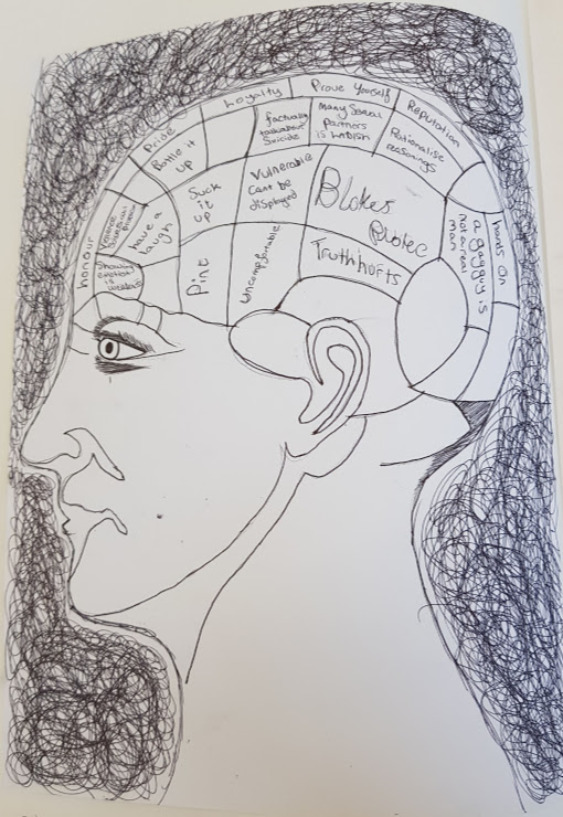
phrenology image
After the results from the questionnaire and i found out the statistic that 1/5 of my feedback came back with that they dont or wouldn’t speak about there feelings. At the start of the project i said that i wanted to change and break the stereotype of manhood and i think that if i look at the mental health issues and look at that route more then i can say that i have fulfilled the criterea. I have been looking at phrenology which i was made aware of by celia and how we as a generation have changed from studying the brain and performing trephaning to see if people have got mental problems, to present day where we talk about our feelings to resolve them. I found a photo of the study of the brain and have found out that this is the study of the brain, size, weight and questioning to determine the diagnosis.
https://pixels.com/featured/phrenology-english-school.html
I have taken this image and changed it up with things which supposedly are on a guys brain stereo typically. I have used black biro pen as alot of the other studies are in black and white and as its an old practicei thought that i would use very basic colours as the understanding was basic. I think that the overall image looks really good with the scribbles around the head giving the head the overall emphasis and context behind it. The text i have used is quotes from various sources from research i have completed. I think that the use of the colouring overall makes the composition what it is. I reall enjoyed studying about the medicine and about mend feelings and thoughts and so i will be looking at this more in the future.
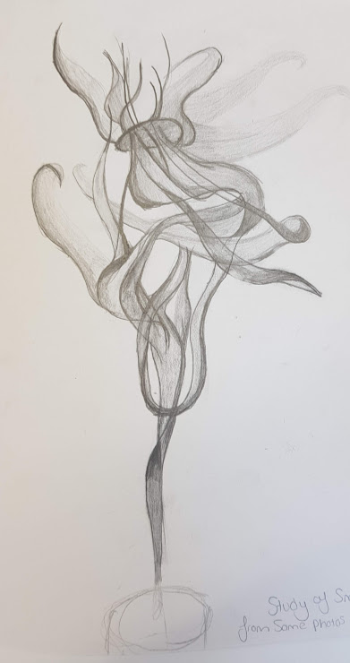
smoke drawing
I through looking at hooliganism and the barbaric view of men. I have found that alot of the hooliganism which happens happens at football games and this i would like to explore. I was quite interseted in the smoke grenades and flares which get set of at games and in the streets when there is scraps. I decided to take some photos of me playing around with these smoke pellets as i found them interesting. These are the photos from the shoot.


I found that the way that the smoke moves with elegance is really nice and creates good movement. I really like in this drawing the tones of shading which i have used as there is lots of deep shading in the piece which show the movement quite clearly which i have found quite difficult. I think that I could use this in the future in a surface pattern with some colour and could start to make some interesting collages.