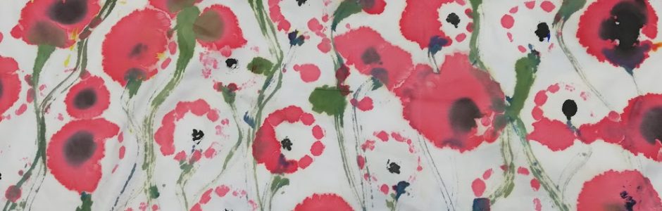
I am lacking in surface patterns which is the area I am specialising in and so I needed to do some more.
I have been looking at the tool print which i did originally and i think that it could do with abit more effort put into it. In this piece I have used the tools drawings and acrylic drawings in this piece as they had got some texture to them which I think will help give the piece more form and texture. I started by playing around with some filters and i found that this one gave the most effect and linked up the drawings best together. This filter brought out the line in the image really nicely which i think when collaborated with the other tools in the fluid pattern style gives it good flow and no one tools stands out too much which i didn’t want to happen. I think that I could tidy it up abit with some of the mark making on some of the tools due to the filter i used. I do however really like how the tools have been spaced out in perfectly to give the piece a lot more fluidity and harmony.

#Unmasculine
I have been looking at some final text samples for the final designs, I think that I just needed something different to mix up the text pieces I have at the moment. I found this style on Pinterest and I think that the boldness and contrasting colours stand out and draw your attention to the piece which is the idea of most art pieces but especially when using typography as there’s usually a meaning to the text and a message which needs to be got across. This is the main aim of my final outcome to get a message across and so I need the text to make the statement clear. I have used some text from the Piers Morgan tweet about Daniel Craig carrying his child. I think that this is a very stereotypical view of modern society that men can’t be feminine and in touch with their emotions which often leads to men bottling problems up and consequently rising suicide rates in men. I think that the text used sums up perfectly why I want to create a final outcome to encourage men to speak out and to break some of the stereotypes of men.


Picomodi (no date) Cha Cha Cha. Available at https://designcrushblog.com/2018/03/07/print-edition-march-2018/ Accessed 15.05.19
Pram and cot pattern
I have looked at some very stereotypically men associated items but not so much the modern mans and so I have looked at some of these. This piece is very simple but quite effective, I have used some contrasting colours which you wouldn’t necessarily affiliate with these products but helps them to stand out in the busy pattern. Again on this piece I have used some filters to help make the blacks less prominent but still noticeable this helps create harmony with the items in the image and brings it all together as one. I have used a type of half brick repeat pattern on this image to give the image more room for more items to be put into the gaps. I could use this as part of a layering piece or would look good for gift wrap but I don’t think that it would work on a shirt type design which is what I am aiming for as my outcome.

Anne lise piece
I have also started to play around with Anne-lise on Photoshop bringing some of the imagery together in one surface pattern. We took the contrasting image approach in this piece combining various items to give the piece a talking point which I think works well when creating pieces of art with a message. We started with the Edvard munch the kiss image I did of Kyle hugging Malik as this shows a 21st century man expressing himself breaking the stereotype of men not being very emotional. We then brought in something to contrast this imagery the tools pattern as these are very stereotypically men’s products and I think that there’s a lot of people who would group these items with men and not the modern man I am trying to pain. Then we took some text the care block print and the independent lettering to again outline the message I am trying to get in these pattern designs. I have then added a set of headphones and the phrenology image to again serve the same purpose.

I really like the outcome of this piece as it quite clearly shows a message which I am trying to emulate but by doing it using the voice of the public taken from the questionnaire results. I think that having the hugging image in the dark colours juxtaposing the other brighter subtle colours works really well as it becomes the emphasis and focal point for the whole image which I think works really nicely. I could see this on a wallpaper design and in some ways is using the tole de joey timorous beasties style as it isn’t what it seems and you need to look and look again to understand the image as a whole and understand the message I am trying to emit.
Words collection


I got some feedback on the patterns I have made already and I have found that they liked the Blokes Bloke image as the colours against the black background work really well and brings out the form of the images. I have decided to use this style again but with some of the words which I have collected already in the not so modern text. The text doesn’t stand out much and the tools border needs to be image traced for it to work.
Green pattern
This again is another very quickly made surface pattern design where the main aim is to play around with colour and possible backgrounds. This image is made up of the two wrench designs I have made, the acrylic paint piece and the half tone repeat patterned piece. I have layered the two images on top of each other and have looked at making a diagonal brick repeat pattern with the two images. I really like the way that the layers build on top of each other and create a really nice repeating pattern. The green half tone wrench possesses a lot of texture on its own so once that is contrasted with the lighter whites and greys of the acrylic paint wrench it makes a really nice rippling effect, and works really nicely as a standalone piece. I do like this piece on its own with the contrasting colours and form which the two layering’s make. I think that this piece is too loud on its own to be used in a design for a t shirt or print, as well as this it isn’t very clear what the image is supposed to be and therefore it wouldn’t provide me with the message I am hoping to show in my final piece.
Me repeated floral this piece isn’t anything special it was just another piece where I have played around with some of the work I have previously completed to make a pattern. I do like the way that the pattern repeats with the flowered background repeating. I haven’t added any filters onto this piece and therefore I think that the effect which the pattern has on its own isn’t that bold. I don’t really like the photo used in the emulsion transfer anyway as it doesn’t exactly show clearly the message of manhood which was in my proposal.

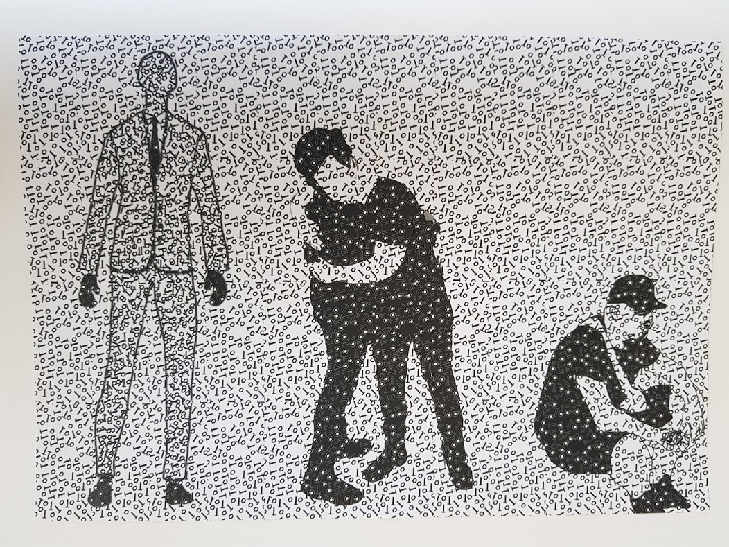
Nut and bolt man
I have improved the previous nut and bolt man as I have added a suit outline to the piece to make it more distinctive. AS well as his I have added 2 more figurines which means there is a lot more going on in the image? I have repeated a snippet of the previous bolt pattern across the whole print size this gives the piece more of a repeat pattern to it which I do like about the print. The three figurines in the image I have made black and white so that it fits the theme of it being very simple but effective with there being things everywhere. I really like how the whole image fits together as one and the different tones of black which layer on top of each other to create shading and movement. I really like the repeat pattern used in this piece and I really think that I could make a nice simple t shirt from it this however is something which I will have to explore.
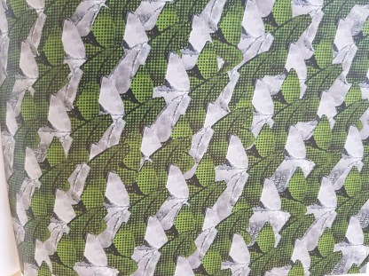
Tools flower print.
I have already made a pattern using the tools with a filter on them but I really liked the effect the filter had on the image so I decided to use these in a different way. From the research I have done into surface pattern I have found that a lot of them have some kind of floral patterning on them which I haven’t looked at so far and is something which stereo typically a man wouldn’t wear.

This is the pattern which I have made from the tools repeating in a flower shape and is really nice with the colourings of the tools filter. I like the half block pattern which I have used in this piece as I think it helps the tools interlock as one and makes the pattern repeat quite effectively. I am going to be using this pattern in a design as I think that is combines the message I am trying to show whilst also having a clear view of what it is made up of. I think that this repeat would work to an extent on some items such as a tie or handkerchief because it is a nice small pattern which would look really good on small scale but not as a large repeating wallpaper. I could improve this by possibly using different colouring’s to give it more of an effect and would look better on different products with the different colours.
GIL N GEORGE
I have looked at working in the style of Gilbert and George as I really like the way that they use the colours in a very block style. In their pieces they tend to use a pattern design as a background layer then build upon that with their imagery or words I Have looked at both in my attempts. I have based this piece on the London themed pattern, I really like how they have used the gas canisters which have got the shiny silvers in them to contrast with the figurines which are very sinister as they are. I have decided to use some imagery of cots prams and dummy’s in my background, as they give a political message as a standalone piece but I think with the characters above them it contrasts more and it gives more of a background which puts the emphasis of the image onto the characters on top as is a brick repeat behind. I have used the drawings of different professions as my silhouettes on top because they show a wide variety of men which I think it is important to show when tackling the issue of stereotypes of men. I think that by using a variety of men in this image it makes the message that all men have a compassionate side to them more clear, which is the aim.


Gilbert and George (2013) Courtesy Galerie Thaddaeus Ropac, Paris/Salzburg Available at. https://www.apollo-magazine.com/london-paris-gilbert-george-thaddaeus-ropac/ Accessed 19.05.19
