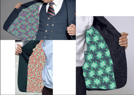
I have got lots of patterns from the week, but I needed to just make some designs out of these designs and add them to shirt designs for the deadline at the end of the week as I need the actual mock ups for the exhibition in a couple of weeks. I started straight away with some tie designs as they were a small surface area to cover and are what men wear I designed these three based on prints I have already made. I really like the tools flower print as it looks like it should be there and looks like a professional job with the large motif in the middle taking the foreground and being the emphasis of the image. I think with the flower pattern behind half brick repeating it looks like it fits the size of the tie best as you can still just about see the patterns made up of tools and would catch the eye if worn.
The text tie isn’t one I like because I think that the text looks too random and doesn’t fit together very well with them all being bunched up together in such a small space. I do however think that this design could work if I made all the text in one font instead of multiple.

The tools print I have just taken and added some different colours to the print to make it look more colourful and less boring as ties should be the feature piece of a suit. I think that would work better with a coloured background as it looks quite bear with the white background.
Final wallpaper design.
This is a final design for a wallpaper built up of lots of different components to make the image fit together whilst also showing the new 21st century man which I stated in my proposal i wanted to achieve in my final outcome. I have taken a lot of the imagery back to the original imagery because they have often got bits on them which I don’t like and once blown up and printed wallpaper size will be really noticeable and won’t look professional. I have made this piece in a similar style to the design I made with Anne Lise as it holds the same concept. In this design I have looked at really getting the message about how a 21st century man actually lives with care and ambition, this still however having some of the stereotypical items in the design with the pipe and the cars this just showing that it is a major hobby of most men but shouldn’t be tied to just men having an interest in. I like the subtle use of colour in this piece with it not being too loud and vibrant but just enough for it to balance out all the black. I am going to use this as my wallpaper design I think as when it has been half brick repeated then the design looks good as it would on a wall and doesn’t look out of place. I could also use it as a point of sale display piece if repeated as I am making tops it could be my shop front, so I will have to play around with it.
T shirt designs
I have designed some formal and informal shirt designs based on the patterns I have been making over the last couple of weeks. These designs are all impressive designs however I will need to pick 3 final designs, I will choose these based on how well they represent the message and theme I want to get across.
Gilbert and gerorge designs
I have been inspired by the supreme range which have recently been brought out with their life and death collection. My tee is simply the design placed onto the front of the tee as this is how it was displayed in the original piece. I have got 2 designs which look very similar except one has the new text on it as the other wasn’t modern enough and didn’t stand out as it should. I do quite like these designs however I think that there is too much going on in the one design for it to be understood. On the other hand, with there being such bright colours in this piece it means that it is very eye-catching which Gilbert and George designs are so well known for. It also has good balance and repeat pattern on it with the two halves’ being the same but not enough as I would like and doesn’t show the surface pattern of too good which is my specialist subject. Overall, I don’t think I will be using these designs in my exhibition as they are too loud and busy which subtracts away from the message of what a real 21st century man is.
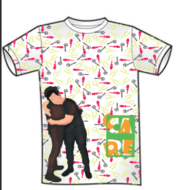
Care design
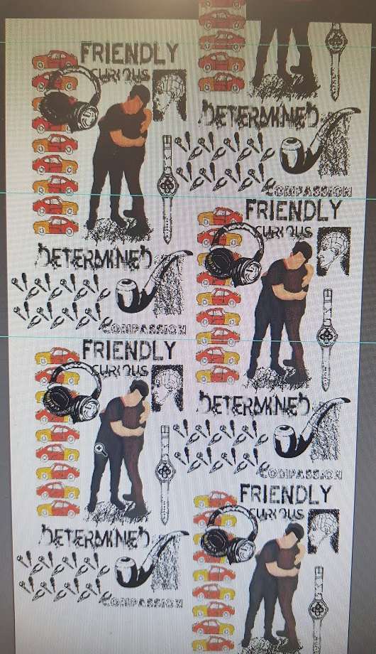
In this design I have made a simple repeat design with two feature pieces on the design. I have used the tools design on this piece as a repeat design because I think that out of all the designs I have made so far that this design is one of the best for what it is as it has good texture good spacing between the motifs and when colour is added it becomes quite attractive and eye catching. I have added the care text test to this design, but I have gone into illustrator with it and got the colours back. As well as this I have got the hugging image and blown that up, so it fills 3/4 of the piece. I believe that with having the care image on this design it becomes the emphasis of the image and is the area that stands out most of which to see two men hugging does symbolise comfort and care being shown and will hopefully make people think again about what a man acts like. This image of care is then reinforced by the text saying care which if the message wasn’t obvious before it should make it. The only negative I would say about this shirt is that I couldn’t see it being produced on a large scale and being on a shelf in a store which is why I don’t think that it is a design is one that I will be producing as a final.
Nut AND BOLT man
I have also made a design from a simple look at nuts and bolts which tied in with the tools theme. I used this pattern originally to make a silhouette of a man, but I found that the more work I did with this design the more I liked it and so I made this repeat for a shirt design. I do really like this design as it offers a lot in terms of the pattern and repeat emphasis. I think that pattern works really well as an all-round design and would work well with a suit and I think fits the design market well. The pattern work does fade around the edges of the t shirt design and I think that this adds effect to the pattern. I think that the only problem with this pattern is that I would have to print all of the fabric out and then cut out the shape of the t shirt and then sew it all together which in the time frame I wouldn’t be able to do make it I would just have to out the design onto a model and then print these sheets of large scale.

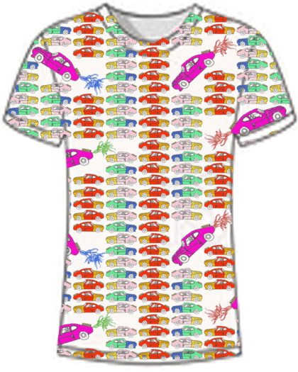
Cars repeat
This design was an improvement on the cars collage design which I originally made. I have used the same cars but have played around with the colours to make them more vibrant and loud which I think on some styles of t-shirt looks great. I have added some of the smoke drawings coming out of the back of the cars to make it seem like they’re moving and flying through the air. I have blown this image up and cut around it in the shape of the t shirt and I think it looks really good. However, I think that there is a lot in this design which I would have to revisit if chosen. There is a strip running down the middle which I don’t like as it breaks up the deign too much and draws emphasis, also the cars are too structured, and I think it would benefit from them being more randomly placed. I don’t think I will be using this design as it is fun and playful which I think is what people look for in a t shirt however the placement isn’t very good and noticeable.
Man layered
From finding out that people liked the black background with the coloured images layered on-top I have looked at designing a t shirt with this same effect. I have gathered a few images which I haven’t used so far and played around with the colours to make them more vivid a layered them on-top of each other. The images don’t have any cohesion I when I look at it from a far as one image and so I don’t really like this design. I still really like the colours layered on top of the black background contrasting however I think that I would have to think about the placement much better and the images would have to have a message with the way they were layered which in this case I didn’t think about, so I won’t be choosing this design.
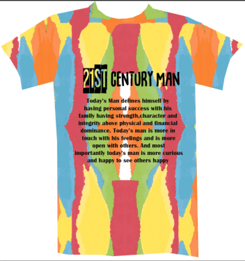
21st century man
I wanted to play more with text in these designs as it is often the easiest way of portraying a message through text and so I thought I would create a definition of what I think is a 21st century man and I have come up with this.” Today’s man defines himself by having personal success with his family having strength, character and integrity above physical and financial dominance. Today’s man is more in touch with his feelings and is more open with others. and most importantly today’s man is more curious and happier to see others happy” I think that this categorises men to a point and the majority of men I think are like this. I have then layered this text in black on top of a card background which I made early on where the text contrasts with the multicoloured background. I rather like this design as its fun it tells a clear message and is to the point, however I don’t think this holds the touel de joey style which I am looking for as its too simple which I don’t want. I think that as a part of the exhibition I could use this design to support but I don’t think that I will use it as a final design.
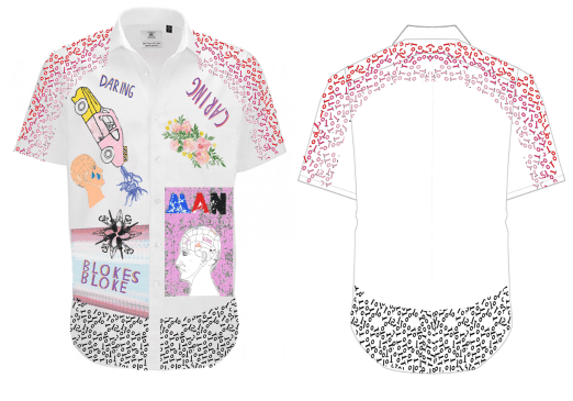
Mixed placed piece
I really like the look of this design with the use of the faint but solid pinks and small amounts of blues and reds. This piece was inspired by an artist I found on Pinterest by Sankuanz. They were my inspiration fort this piece as they have used similar colours and the placement of the imagery is very similar also. I really like the use of line in this piece as they have used what looks like crayon markings around the tee to add that childish effect where things are everywhere. I have however used a range of imagery which relates to a modern man with the new man with the phrenology piece and bits of the DNA of men to be interested in cars and heavy machinery. I have however adapted these traditional items for example with the tools have manipulated them into a flower design to make it look less rugged and help it fit into the style of the placement. I really like the way that both new and old man have been combined into one on this design to fit the proposal brief as I am breaking the stereotype with the colouring’s and imagery but also keeping in some vital parts which you can’t erase like the love of cars. The message is also clear with the use of text “caring, daring”. I think I am going to explore more with this design as it does fit the proposal but also looks good.
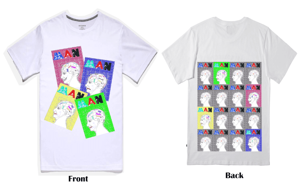
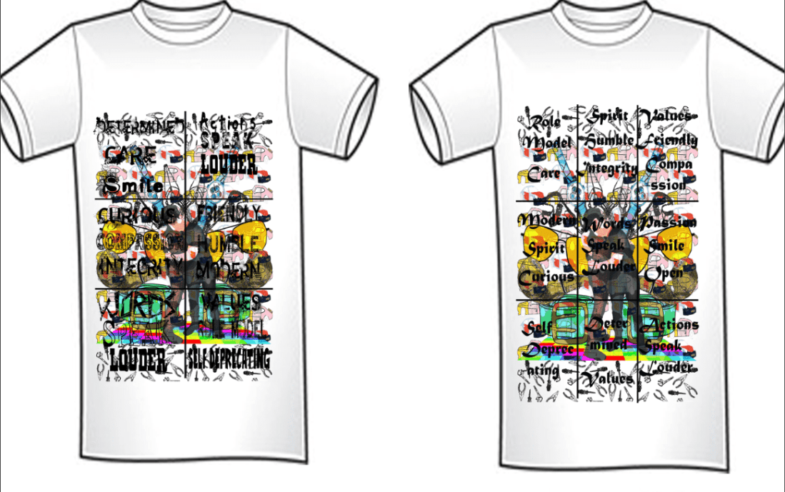
phren tee
I really like the phrenology design which I made originally and I wanted to make a design out of this somehow and so I started repeating the design to test what it looked like. I found that it looked really good but could do with some more colour to make it look better and more modern. I played around with bright colours as I want to make a message which will stand out and it will draw attention if I do so. With the colouring’s in this formation the design really stands out and does fill the back piece up well and this means that I can have a message front and back which is great as it is the aim of the proposal. I also put these designs on the front to balance out the amount of detail on the back but blown up so that the designs and the different words in the phrenology head are visible at a glance which people will be drawn to because of the colouring. I think I will use this design due to the bright colouring and the fact that it is based on men’s brains which often their thoughts re kept bottled up, so it is combating two big issues and I think that it would fit in with the street wear designs such as Gilbert and George supreme collab.