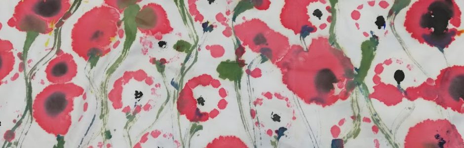
colourful pieces with text and surface pattern
I have found this artist Gilbert and George who create political pieces of art on a large canvas using various styles. I really like the use of the really bright in your face vibrant colours which are accustomed to in every piece which they create. They often apply text as a top layer to most of their images which support and make the piece more apparent as to what the message is as their pieces are very difficult to make out a message without the context.
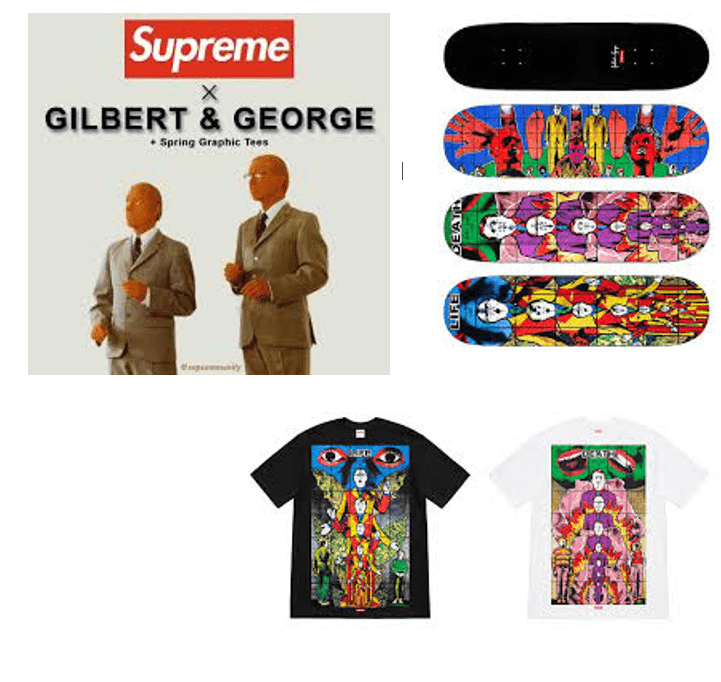
There work has been recognised and have done a collab with 𝓢𝓾𝓹𝓻𝓮𝓶𝓮 a skate-wear clothing brand which I am very fond of. I really like how their political pieces have been recognised but purely for the colour and form of the image which has possessed the image to become one which is worn by trendy members of society.
I have looked at working in the style of Gilbert and George as I really like the way that they use the colours in a very block style. In their pieces they tend to use a pattern design as a background layer then build upon that with their imagery or words I Have looked at both in my attempts. I have based this piece on the London themed pattern, I really like how they have used the gas canisters which have got the shiny silvers in them to contrast with the figurines which are very sinister as they are. I have decided to use some imagery of cots prams and dummy’s in my background, as they give a political message as a standalone piece but I think with the characters above them it contrasts more and it gives more of a background which puts the emphasis of the image onto the characters on top as is a brick repeat behind. I have used the drawings of different professions as my silhouettes on top because they show a wide variety of men which I think it is important to show when tackling the issue of stereotypes of men. I think that by using a variety of men in this image it makes the message that all men have a compassionate side to them more clear, which is the aim.

Gilbert and George (2013) Courtesy Galerie Thaddaeus Ropac, Paris/Salzburg Available at. https://www.apollo-magazine.com/london-paris-gilbert-george-thaddaeus-ropac/ Accessed 19.05.19

Gilbert and George (2011) Terror plot. Available at http://www.arndtfineart.com/website/artist_986 Accessed.19,05.19
I have also looked at their text pieces which again are used to provide a political image. I think that however in this piece the message is a lot clearer. I have taken inspiration from the terror plot piece as in this piece again there is layering and a repeat pattern which adds contrast and I really like the effect which this produces. I have built up and image which has the hugging image in the middle and a lot of men’s products surrounding them repeating. I have also added the car collage to the back of this however using a hard light filter on it to make sure it doesn’t take away from the image too much. I have then also used the tools pattern to add a border to the image.


I needed some text to be at the forefront of this image and therefore I found a website which described a modern 21st century man which I have taken select words from and written in a list. I have looked at the different fonts on word and have taken these into consideration and have picked Matura MT Script Capitals as the best as I think that they are quite bold letters so they will stand out but they also look quite nice and therefore should be the main emphasis of the image as Gilbert and Georges is. the final outcome is really nice and I think works really well together when the colours behind are knocked back however I think that some of the imagery behind is too large with things such as the belt and is quite distracting from the text.
I also think that the text doesn’t look very modern once all blocked together. I found some different text on 1000 and one fonts baby which was under the category grunge which gives the text more of a modern twist and I think it looks better more modern and more inspiring , this looks much better because there is much more variety on this because they have got a lot more texture to the images.


.
