week 10 Nightmare week

I have been looking at the work which I have produced over the last week and I think that I could improve what i have produced.

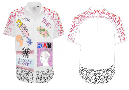
I think that what I have achieved is good but could be of a higher standard with more research and a potentially better outcome with more of a professional look design. The final outcome of the shirt design looks good but wasn’t what I had originally foreseen. my original design was going to be on a short sleeved smart shirt however I couldn’t get one for my possession which was annoying but I did get a shirt from Celia which I sublimated onto. This shirt was bigger than I had planned for and so the pieces which I have printed out were much more spaced out than I had originally designed and I think that maybe a different design could work better.

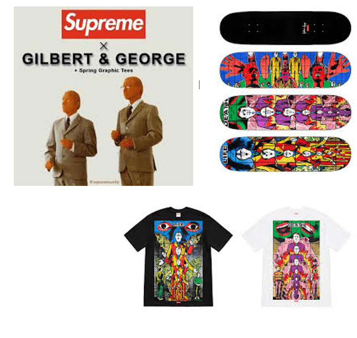
I started by doing some more research into some more shirt designers and looking at some different styles. I have looked at a variety of named brand s which I think will work best with the material and shirt pattern which is on offer. From this research I have then made some more designs for shirts with my work based on the top designers to make sure I have a clear understanding of the aim for exhibition and the whole project outcome.

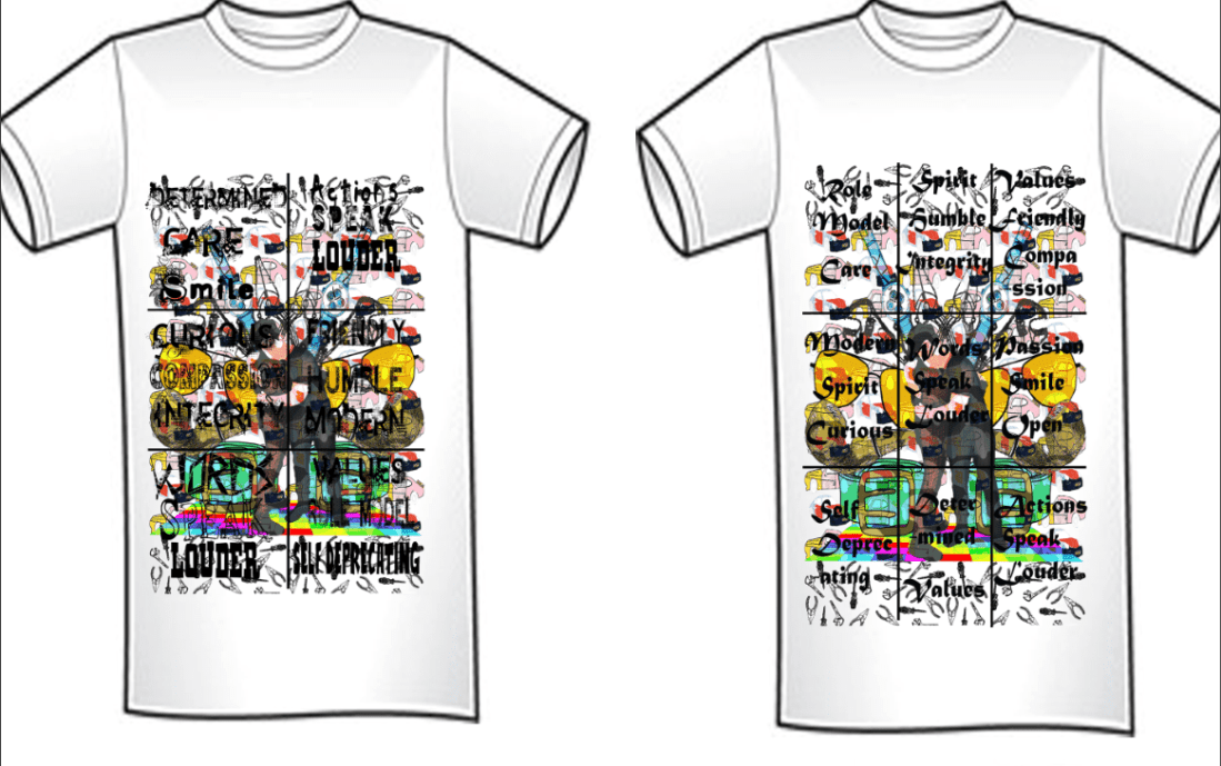
Out of all the t shirt designs I have picked I really like these 4 designs the most as I feel they offer the most with their design principles but also because they are all different but all look like designs which could be manipulated to possess a message which ultimately I am trying to show.

These are the final designs which I have made based on the research I have done.

lv designs

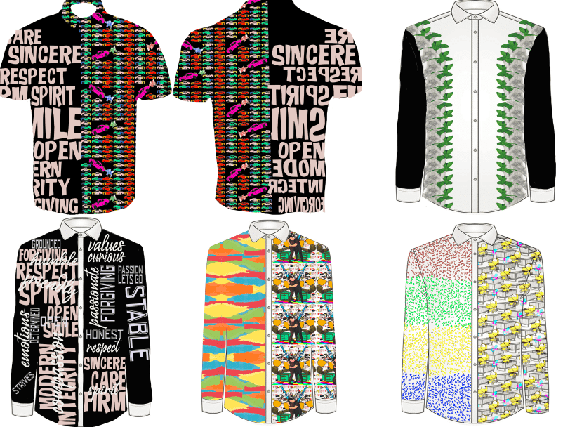
I really like the Balenciaga design as I can incorporate a lot of text onto one design this I think I haven’t been able to do in the other shirt designs but I think is a major part of the project as a whole which is why I want to make a design which has this in it. In this design I have tried to use various different types of text as Balenciaga have because I think it makes the tee stand out more than if I was to use one style as there isn’t one part which becomes the emphasis of the design but it is an all over print which makes the design stronger. I have used some text examples from 1001 fonts’ baby for some text. I have used Saul bass and his text style in this design because I think that this way of working with the bold lettering works really well with the text and makes the message stronger because it is more prominent and stands out as a movie poster should.
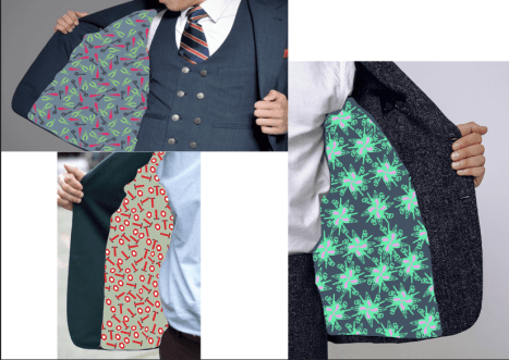
The Louis Vuitton design also works quite well but I think it doesn’t work the same as the actual design should with the pattern on the shirt is a lot more fluid and loose which suits the style and design. However I think that my design is very rigid which I think looks odd where the pattern stops and starts having blanks where the text is. In addition to this where I have added text to the other half I think that there needs to be more varied in size and direction as I don’t think that there’s enough testing and variety in the designs. The colour ways I have used in this design I don’t think work well together and the colours won’t work well on a shirt especially a black one as it would need to be transferred which leaves a shine where the lv shirts don’t which is why I won’t choose this design for production.

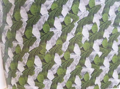
I am do quite like the leaf like design as I think that it is simple but effective and I think that this design would work on a model and I think it is a design which I could see in a shop and I would personally wear. The only thing that I think puts me of making this design is that there isn’t really a clear message in the design which I need for my final design I think that there is a lot more of this type of design because there is not really a lot which I can do because I would need a black shirt which I haven’t previously been able to find. I think that the logistics would be too hard to peruse and therefore I won’t be testing this design.

Half and half designs I quite like these designs because I think that I can really bring some of the best designs together as one which I think when together they work really well. I have done two designs using this style and I think that both look really good and could work well. The only issue I have with both designs is that they don’t really have a clear message and people wouldn’t see the meaning behind the designs which I really want it to. I think that the contrast in colours works well on both designs especially the prams and nuts and bolts half as I think the colour pallet is very different on both sides. I think that the shirt is interesting in itself to look at and would draw attention and would sell because of how different it is but I don’t think people would understand the message as I would want them to which is why don’t think I will be using this design style.

Tests

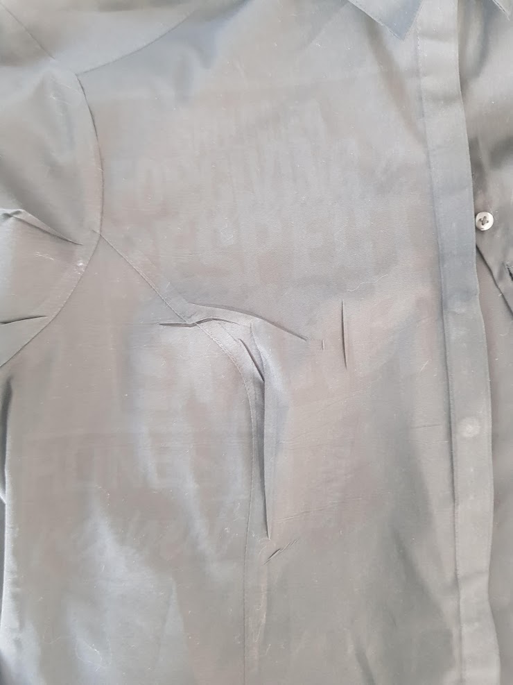
I have chosen to test the Balenciaga text design as I think that I couldn’t make a message any clearer and that is why I think that this design could work. I decided to try and do it as shown with the black shirt and light text. I found a shirt but it was a woman’s but as a test I tried it out and I didn’t get the result I wanted. Firstly the text was too small when printed a3 size and so I wanted to then test with the text on one half of the design. I sublimated first but this failed awfully as none of the text showed which I was disappointed about but was understandable with a black fabric. I knew that this wouldn’t work again with the black shirt so I abandoned that and moved on.

work 4

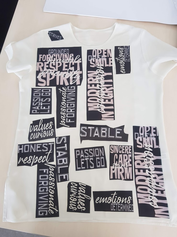
I tested then on a cream polyester shirt which I had brought and the text worked a lot better but was messier. I still had the black background on the text pieces but I tested anyway and I got some interesting results. I found that the text showed really clearly which I wanted but with the text being jumbled as it was originally supposed to be for a black tee the cut outs were of odd shapes this I think added a rough messy effect but all of them should of been the same for it to of worked however this was only executed on one or two of the text pieces and I think that it doesn’t work as well as it should especially on the cream top. It did capture the colours really well though and I think it would if planned better.

work 3

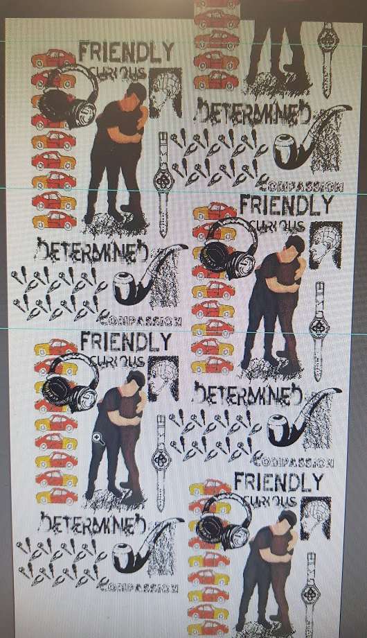
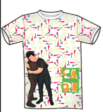
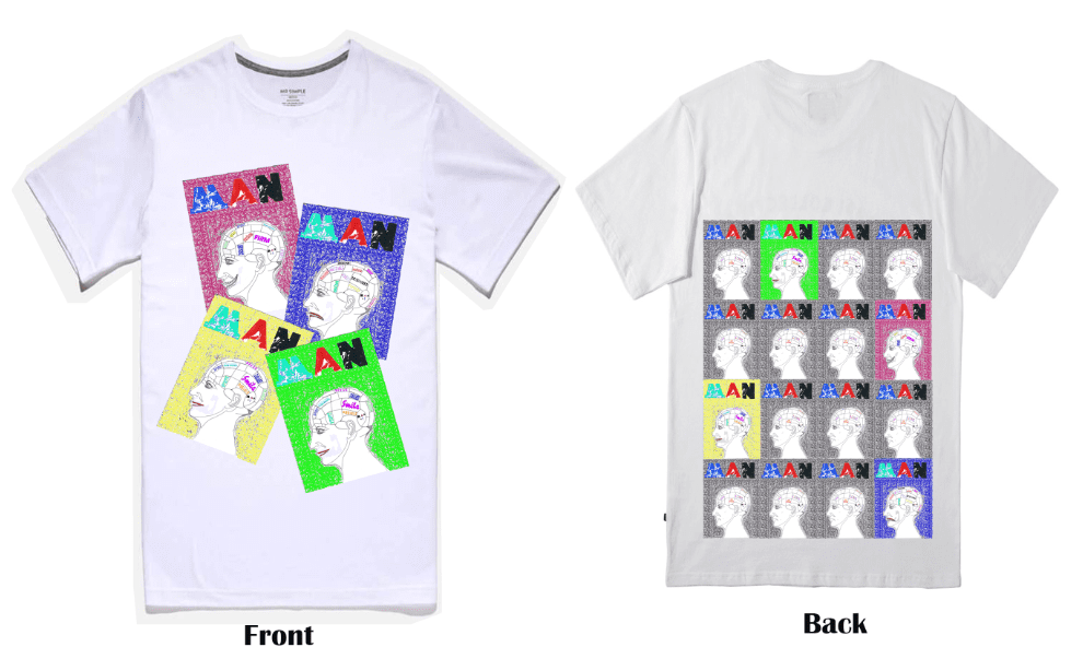
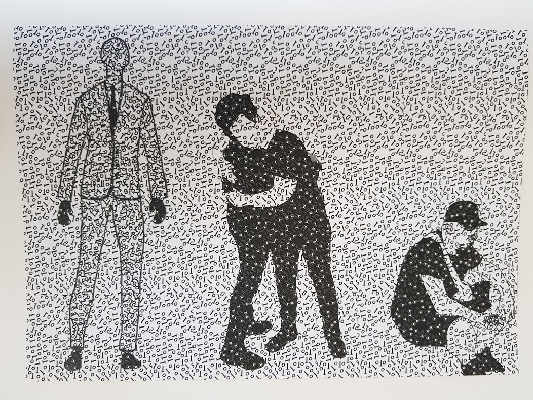
Tshirt transfer I finally got to test the t-shirt transfer but it was testing for my final design I already knew that I would use the phrenology heads and had tested these and they worked really well I just needed to do it again but better. I only had A4 paper and so this is what I would use I really like the outcome of the paper because it leaves a shiny matt finish but uses the colour really well and I really like this. The only issue I would have would be the printing onto the dark shirt as there was only one piece of transfer paper for this and therefore I would have to get this right first time. I have chosen to use the layered man design as I think it does show a message with the different items layered on-top of each other. The only way I could improve this design would be to have the original design with it stemming from the bottom up in a thicker design so that it covers the whole of the t shirt rather than just an a4 square which I have currently designed. I am happy with the final outcomes and I think that they are well presented and the transfer paper has worked really well and I don’t think that I could of improved it much more the only thing I am not happy with is that the front panel for the phren heads is more to the right than centre and I think that it is noticeable but others don’t so I think it will be alright and I could just put it with the back piece so that it isn’t noticeable. I found the technique really useful and I think that I should have used it earlier as it is much easier and provides better results with the gradient of colour.

I have also chosen a first display which I would like to see the display look like for the exhibition. I have got 2 boards of which I can display onto.

 I was happy with the outcome of this display although it wasn’t what I had originally planned. I had designed the space so that It would look like a point of sale display this I had found worked really well when doing some quick design sketches of the space and how I wanted it to look this I think would utilise the space well with all of the shirts being visible and the wallpaper banners acting as the sale displays. I quickly found that the boards were taller than expected with less width this meant that once the banners were printed I would have no room for anything else and so decided to go with just the one banner which was printed out full height and half the board width. I also think that two strips would have been too much and would have made the space too busy which I didn’t want. I was going to try using some photos of someone modelling the shirt as images in a strip but again I would be taking up space so I kept with the shirt 2 t shirts and wallpaper banner. I went on to add the name of the company above the shirt as it was too bare and needed filling in this fit nicely with the colour pink as I had got quite a lot of pink in the designs already. I think that the display balanced really nicely and wasn’t too much to look at. I think that the display met the aims of what I was trying to achieve with the point of sale which I think could work in a shop challenging stereotypes.


Tests of final designs

Phren tee test

For this test printed my design onto a cotton t-shirt using sublimation. As you can see the colours haven’t come through as well as I would have hoped however the colour is still visible and the text too. With this test thee was a few problems which the pictures show mainly the colour being faded this was because of the material used. I know for my next test however that I need to use polyester or nylon as this takes the colour best. I also had some issues with the large back piece as it isn’t in the middle and is off centre. In addition to this the ink has leaked through onto the back from the front image and has left a green mark which to the camera isn’t visible but is to the eye. I also found that the cars border was difficult to get all the way around and therefore there is a chunk missing. However I do think that the design itself works really well and I am sure I would be happy with the outcome when I make a final shirt with this design.


Mixed placed shirt

I really like this design as a concept but this test turned out to be a real nightmare. From my last test I found that cotton doesn’t sublimate well and therefore I went and brought a 100% polyester shirt to test. This shirt was a women’s but would have worked well. I was told to heat the fabric up to get it used to the temp of the sublimate so I used the iron. I forgot to use greaseproof paper and the iron melted the polyester and left a large hole in the shirt this t shirt was no longer fit for purpose but I still tester to see the colours. I then put the paper sublimation paper the wrong way around which meant only a tiny amount of ink transferred onto the shirt and left faint print. Once transferred properly the inks worked and looked really vibrant and bold which was the result I wanted however the t shirt did scorch and turn brown because of the heat. The collar ink also ran out onto the shirt and left black ink marks. I think that on my next test if I manage to find another polyester t shirt I will be more careful in my printing and will make sure that I use plenty of grease proof paper too get the result I want.


Final test mixed tee

I got given another partly cotton t shirt but I didn’t have lots of time so I went ahead and used it. Firstly however I did a quick test with the temperature at 185’ and 210’ to see which the colour would print best at. I found that there wasn’t much in the printed article however at 210 more of the ink transferred of the paper which is why I chose it to use. I then went on with Celia’s help to print onto the shirt and this is the finished thing. I am happy with how this looks as all items printed as they should of and there was no mess ups. The only thing I would change and will have to sort out is that the shirt goes brown scorched because of the heat and so I will give it a wash at a cool temperature to try and remove this. In addition to this the shirt was a long sleeve one which meant I needed to further the pattern so it wouldn’t look a miss. I had some pattern lest and so I wrapped it around the cuffs. This is a technique Paul Smith would use as when worn with a suit the cuffs hang out and will be shown off and it looks very stylish.

Gilbert and George

colourful pieces with text and surface pattern

I have found this artist Gilbert and George who create political pieces of art on a large canvas using various styles. I really like the use of the really bright in your face vibrant colours which are accustomed to in every piece which they create. They often apply text as a top layer to most of their images which support and make the piece more apparent as to what the message is as their pieces are very difficult to make out a message without the context.

There work has been recognised and have done a collab with 𝓢𝓾𝓹𝓻𝓮𝓶𝓮 a skate-wear clothing brand which I am very fond of. I really like how their political pieces have been recognised but purely for the colour and form of the image which has possessed the image to become one which is worn by trendy members of society.

SUPREME

I have looked at working in the style of Gilbert and George as I really like the way that they use the colours in a very block style. In their pieces they tend to use a pattern design as a background layer then build upon that with their imagery or words I Have looked at both in my attempts. I have based this piece on the London themed pattern, I really like how they have used the gas canisters which have got the shiny silvers in them to contrast with the figurines which are very sinister as they are. I have decided to use some imagery of cots prams and dummy’s in my background, as they give a political message as a standalone piece but I think with the characters above them it contrasts more and it gives more of a background which puts the emphasis of the image onto the characters on top as is a brick repeat behind. I have used the drawings of different professions as my silhouettes on top because they show a wide variety of men which I think it is important to show when tackling the issue of stereotypes of men. I think that by using a variety of men in this image it makes the message that all men have a compassionate side to them more clear, which is the aim.

Image result for GILBERT AND GEORGE LONDON

Gilbert and George (2013)  Courtesy Galerie Thaddaeus Ropac, Paris/Salzburg Available at. https://www.apollo-magazine.com/london-paris-gilbert-george-thaddaeus-ropac/ Accessed 19.05.19

Image result for GILBERT AND GEORGE LONDON

Gilbert and George (2011) Terror plot. Available at http://www.arndtfineart.com/website/artist_986 Accessed.19,05.19

I have also looked at their text pieces which again are used to provide a political image. I think that however in this piece the message is a lot clearer. I have taken inspiration from the terror plot piece as in this piece again there is layering and a repeat pattern which adds contrast and I really like the effect which this produces. I have built up and image which has the hugging image in the middle and a lot of men’s products surrounding them repeating. I have also added the car collage to the back of this however using a hard light filter on it to make sure it doesn’t take away from the image too much. I have then also used the tools pattern to add a border to the image.

blog ;

I needed some text to be at the forefront of this image and therefore I found a website which described a modern 21st century man which I have taken select words from and written in a list.  I have looked at the different fonts on word and have taken these into consideration and have picked Matura MT Script Capitals as the best as I think that they are quite bold letters so they will stand out but they also look quite nice and therefore should be the main emphasis of the image as Gilbert and Georges is. the final outcome is really nice and I think works really well together when the colours behind are knocked back however I think that some of the imagery behind is too large with things such as the belt and is quite distracting from the text.

I also think that the text doesn’t look very modern once all blocked together. I found some different text on 1000 and one fonts baby which was under the category grunge which gives the text more of a modern twist and I think it looks better more modern and more inspiring , this looks much better because there is much more variety on this because they have got a lot more texture to the images.


.

week 9 final development :(

I have got lots of patterns from the week, but I needed to just make some designs out of these designs and add them to shirt designs for the deadline at the end of the week as I need the actual mock ups for the exhibition in a couple of weeks. I started straight away with some tie designs as they were a small surface area to cover and are what men wear I designed these three based on prints I have already made. I really like the tools flower print as it looks like it should be there and looks like a professional job with the large motif in the middle taking the foreground and being the emphasis of the image. I think with the flower pattern behind half brick repeating it looks like it fits the size of the tie best as you can still just about see the patterns made up of tools and would catch the eye if worn.

The text tie isn’t one I like because I think that the text looks too random and doesn’t fit together very well with them all being bunched up together in such a small space. I do however think that this design could work if I made all the text in one font instead of multiple.

alternative 1

The tools print I have just taken and added some different colours to the print to make it look more colourful and less boring as ties should be the feature piece of a suit. I think that would work better with a coloured background as it looks quite bear with the white background.

alternative

Final wallpaper design.

This is a final design for a wallpaper built up of lots of different components to make the image fit together whilst also showing the new 21st century man which I stated in my proposal i wanted to achieve in my final outcome. I have taken a lot of the imagery back to the original imagery because they have often got bits on them which I don’t like and once blown up and printed wallpaper size will be really noticeable and won’t look professional. I have made this piece in a similar style to the design I made with Anne Lise as it holds the same concept. In this design I have looked at really getting the message about how a 21st century man actually lives with care and ambition, this still however having some of the stereotypical items in the design with the pipe and the cars this just showing that it is a major hobby of most men but shouldn’t be tied to just men having an interest in. I like the subtle use of colour in this piece with it not being too loud and vibrant but just enough for it to balance out all the black. I am going to use this as my wallpaper design I think as when it has been half brick repeated then the design looks good as it would on a wall and doesn’t look out of place. I could also use it as a point of sale display piece if repeated as I am making tops it could be my shop front, so I will have to play around with it.

wallpapaer

T shirt designs

I have designed some formal and informal shirt designs based on the patterns I have been making over the last couple of weeks. These designs are all impressive designs however I will need to pick 3 final designs, I will choose these based on how well they represent the message and theme I want to get across.

Gilbert and gerorge designs

I have been inspired by the supreme range which have recently been brought out with their life and death collection. My tee is simply the design placed onto the front of the tee as this is how it was displayed in the original piece. I have got 2 designs which look very similar except one has the new text on it as the other wasn’t modern enough and didn’t stand out as it should. I do quite like these designs however I think that there is too much going on in the one design for it to be understood. On the other hand, with there being such bright colours in this piece it means that it is very eye-catching which Gilbert and George designs are so well known for. It also has good balance and repeat pattern on it with the two halves’ being the same but not enough as I would like and doesn’t show the surface pattern of too good which is my specialist subject. Overall, I don’t think I will be using these designs in my exhibition as they are too loud and busy which subtracts away from the message of what a real 21st century man is.

designs

Care design

In this design I have made a simple repeat design with two feature pieces on the design. I have used the tools design on this piece as a repeat design because I think that out of all the designs I have made so far that this design is one of the best for what it is as it has good texture good spacing between the motifs and when colour is added it becomes quite attractive and eye catching. I have added the care text test to this design, but I have gone into illustrator with it and got the colours back. As well as this I have got the hugging image and blown that up, so it fills 3/4 of the piece. I believe that with having the care image on this design it becomes the emphasis of the image and is the area that stands out most of which to see two men hugging does symbolise comfort and care being shown and will hopefully make people think again about what a man acts like. This image of care is then reinforced by the text saying care which if the message wasn’t obvious before it should make it. The only negative I would say about this shirt is that I couldn’t see it being produced on a large scale and being on a shelf in a store which is why I don’t think that it is a design is one that I will be producing as a final.

designs 1

Nut AND BOLT man

I have also made a design from a simple look at nuts and bolts which tied in with the tools theme. I used this pattern originally to make a silhouette of a man, but I found that the more work I did with this design the more I liked it and so I made this repeat for a shirt design. I do really like this design as it offers a lot in terms of the pattern and repeat emphasis. I think that pattern works really well as an all-round design and would work well with a suit and I think fits the design market well. The pattern work does fade around the edges of the t shirt design and I think that this adds effect to the pattern. I think that the only problem with this pattern is that I would have to print all of the fabric out and then cut out the shape of the t shirt and then sew it all together which in the time frame I wouldn’t be able to do make it I would just have to out the design onto a model and then print these sheets of large scale.

designs 3

Cars repeat

This design was an improvement on the cars collage design which I originally made. I have used the same cars but have played around with the colours to make them more vibrant and loud which I think on some styles of t-shirt looks great. I have added some of the smoke drawings coming out of the back of the cars to make it seem like they’re moving and flying through the air. I have blown this image up and cut around it in the shape of the t shirt and I think it looks really good. However, I think that there is a lot in this design which I would have to revisit if chosen. There is a strip running down the middle which I don’t like as it breaks up the deign too much and draws emphasis, also the cars are too structured, and I think it would benefit from them being more randomly placed. I don’t think I will be using this design as it is fun and playful which I think is what people look for in a t shirt however the placement isn’t very good and noticeable.

designs 4

Man layered

From finding out that people liked the black background with the coloured images layered on-top I have looked at designing a t shirt with this same effect. I have gathered a few images which I haven’t used so far and played around with the colours to make them more vivid a layered them on-top of each other. The images don’t have any cohesion I when I look at it from a far as one image and so I don’t really like this design. I still really like the colours layered on top of the black background contrasting however I think that I would have to think about the placement much better and the images would have to have a message with the way they were layered which in this case I didn’t think about, so I won’t be choosing this design.

designs 7

21st century man

I wanted to play more with text in these designs as it is often the easiest way of portraying a message through text and so I thought I would create a definition of what I think is a 21st century man and I have come up with this.” Today’s man defines himself by having personal success with his family having strength, character and integrity above physical and financial dominance. Today’s man is more in touch with his feelings and is more open with others. and most importantly today’s man is more curious and happier to see others happy” I think that this categorises men to a point and the majority of men I think are like this. I have then layered this text in black on top of a card background which I made early on where the text contrasts with the multicoloured background. I rather like this design as its fun it tells a clear message and is to the point, however I don’t think this holds the touel de joey style which I am looking for as its too simple which I don’t want. I think that as a part of the exhibition I could use this design to support but I don’t think that I will use it as a final design.

designs 5

Mixed placed piece

I really like the look of this design with the use of the faint but solid pinks and small amounts of blues and reds. This piece was inspired by an artist I found on Pinterest by Sankuanz. They were my inspiration fort this piece as they have used similar colours and the placement of the imagery is very similar also. I really like the use of line in this piece as they have used what looks like crayon markings around the tee to add that childish effect where things are everywhere. I have however used a range of imagery which relates to a modern man with the new man with the phrenology piece and bits of the DNA of men to be interested in cars and heavy machinery. I have however adapted these traditional items for example with the tools have manipulated them into a flower design to make it look less rugged and help it fit into the style of the placement. I really like the way that both new and old man have been combined into one on this design to fit the proposal brief as I am breaking the stereotype with the colouring’s and imagery but also keeping in some vital parts which you can’t erase like the love of cars. The message is also clear with the use of text “caring, daring”. I think I am going to explore more with this design as it does fit the proposal but also looks good.

designs 2

phren tee

I really like the phrenology design which I made originally and I wanted to make a design out of this somehow and so I started repeating the design to test what it looked like. I found that it looked really good but could do with some more colour to make it look better and more modern. I played around with bright colours as I want to make a message which will stand out and it will draw attention if I do so. With the colouring’s in this formation the design really stands out and does fill the back piece up well and this means that I can have a message front and back which is great as it is the aim of the proposal. I also put these designs on the front to balance out the amount of detail on the back but blown up so that the designs and the different words in the phrenology head are visible at a glance which people will be drawn to because of the colouring. I think I will use this design due to the bright colouring and the fact that it is based on men’s brains which often their thoughts re kept bottled up, so it is combating two big issues and I think that it would fit in with the street wear designs such as Gilbert and George supreme collab.

designs 6


21st century man def

http://www.shrivermedia.com/insight-into-the-21st-century-man/

I needed some more designs for t shirts and I wanted to make one with the definition of the 21st century man as I do like the way that the design looks. I have found this definition on the internet which I have taken and manipulated to make it shorter and fit on the t shirt. This was the definition I came up with. “Today’s Man defines himself by having personal success with his family having strength, character and integrity above physical and financial dominance. Today’s man is more in touch with his feelings and is more open with others. And most importantly today’s man is more curious and happy to see others happy” I think that this definition fits the whole message that I want to perceive for the whole project.

pictureeee.png

Week 8 final final development “making”

I am lacking in surface patterns which is the area I am specialising in and so I needed to do some more.

I have been looking at the tool print which i did originally and i think that it could do with abit more effort put into it. In this piece I have used the tools drawings and acrylic drawings in this piece as they had got some texture to them which I think will help give the piece more form and texture. I started by playing around with some filters and i found that this one gave the most effect and linked up the drawings best together. This filter brought out the line in the image really nicely which i think when collaborated with the other tools in the fluid pattern style gives it good flow and no one tools stands out too much which i didn’t want to happen. I think that I could tidy it up abit with some of the mark making on some of the tools due to the filter i used. I do however really like how the tools have been spaced out in perfectly to give the piece a lot more fluidity and harmony.

blog pic 6

#Unmasculine

I have been looking at some final text samples for the final designs, I think that I just needed something different to mix up the text pieces I have at the moment. I found this style on Pinterest and I think that the boldness and contrasting colours stand out and draw your attention to the piece which is the idea of most art pieces but especially when using typography as there’s usually a meaning to the text and a message which needs to be got across. This is the main aim of my final outcome to get a message across and so I need the text to make the statement clear. I have used some text from the Piers Morgan tweet about Daniel Craig carrying his child. I think that this is a very stereotypical view of modern society that men can’t be feminine and in touch with their emotions which often leads to men bottling problems up and consequently rising suicide rates in men. I think that the text used sums up perfectly why I want to create a final outcome to encourage men to speak out and to break some of the stereotypes of men.

Picomodi (no date) Cha Cha Cha. Available at https://designcrushblog.com/2018/03/07/print-edition-march-2018/ Accessed 15.05.19

Pram and cot pattern

I have looked at some very stereotypically men associated items but not so much the modern mans and so I have looked at some of these. This piece is very simple but quite effective, I have used some contrasting colours which you wouldn’t necessarily affiliate with these products but helps them to stand out in the busy pattern. Again on this piece I have used some filters to help make the blacks less prominent but still noticeable this helps create harmony with the items in the image and brings it all together as one. I have used a type of half brick repeat pattern on this image to give the image more room for more items to be put into the gaps. I could use this as part of a layering piece or would look good for gift wrap but I don’t think that it would work on a shirt type design which is what I am aiming for as my outcome.

blog p

Anne lise piece

I have also started to play around with Anne-lise on Photoshop bringing some of the imagery together in one surface pattern. We took the contrasting image approach in this piece combining various items to give the piece a talking point which I think works well when creating pieces of art with a message. We started with the Edvard munch the kiss image I did of Kyle hugging Malik as this shows a 21st century man expressing himself breaking the stereotype of men not being very emotional. We then brought in something to contrast this imagery the tools pattern as these are very stereotypically men’s products and I think that there’s a lot of people who would group these items with men and not the modern man I am trying to pain. Then we took some text the care block print and the independent lettering to again outline the message I am trying to get in these pattern designs. I have then added a set of headphones and the phrenology image to again serve the same purpose.

blog o

I really like the outcome of this piece as it quite clearly shows a message which I am trying to emulate but by doing it using the voice of the public taken from the questionnaire results. I think that having the hugging image in the dark colours juxtaposing the other brighter subtle colours works really well as it becomes the emphasis and focal point for the whole image which I think works really nicely. I could see this on a wallpaper design and in some ways is using the tole de joey timorous beasties style as it isn’t what it seems and you need to look and look again to understand the image as a whole and understand the message I am trying to emit.

Words collection

blog iblog j

I got some feedback on the patterns I have made already and I have found that they liked the Blokes Bloke image as the colours against the black background work really well and brings out the form of the images. I have decided to use this style again but with some of the words which I have collected already in the not so modern text. The text doesn’t stand out much and the tools border needs to be image traced for it to work.

Green pattern

This again is another very quickly made surface pattern design where the main aim is to play around with colour and possible backgrounds. This image is made up of the two wrench designs I have made, the acrylic paint piece and the half tone repeat patterned piece. I have layered the two images on top of each other and have looked at making a diagonal brick repeat pattern with the two images. I really like the way that the layers build on top of each other and create a really nice repeating pattern. The green half tone wrench possesses a lot of texture on its own so once that is contrasted with the lighter whites and greys of the acrylic paint wrench it makes a really nice rippling effect, and works really nicely as a standalone piece. I do like this piece on its own with the contrasting colours and form which the two layering’s make. I think that this piece is too loud on its own to be used in a design for a t shirt or print, as well as this it isn’t very clear what the image is supposed to be and therefore it wouldn’t provide me with the message I am hoping to show in my final piece.

blog e

Me repeated floral this piece isn’t anything special it was just another piece where I have played around with some of the work I have previously completed to make a pattern. I do like the way that the pattern repeats with the flowered background repeating. I haven’t added any filters onto this piece and therefore I think that the effect which the pattern has on its own isn’t that bold. I don’t really like the photo used in the emulsion transfer anyway as it doesn’t exactly show clearly the message of manhood which was in my proposal.

flower e

Nut and bolt man

I have improved the previous nut and bolt man as I have added a suit outline to the piece to make it more distinctive. AS well as his I have added 2 more figurines which means there is a lot more going on in the image? I have repeated a snippet of the previous bolt pattern across the whole print size this gives the piece more of a repeat pattern to it which I do like about the print. The three figurines in the image I have made black and white so that it fits the theme of it being very simple but effective with there being things everywhere. I really like how the whole image fits together as one and the different tones of black which layer on top of each other to create shading and movement. I really like the repeat pattern used in this piece and I really think that I could make a nice simple t shirt from it this however is something which I will have to explore.

NUT N BOLT 2.0

Tools flower print.

I have already made a pattern using the tools with a filter on them but I really liked the effect the filter had on the image so I decided to use these in a different way. From the research I have done into surface pattern I have found that a lot of them have some kind of floral patterning on them which I haven’t looked at so far and is something which stereo typically a man wouldn’t wear.

blog b

This is the pattern which I have made from the tools repeating in a flower shape and is really nice with the colourings of the tools filter. I like the half block pattern which I have used in this piece as I think it helps the tools interlock as one and makes the pattern repeat quite effectively. I am going to be using this pattern in a design as I think that is combines the message I am trying to show whilst also having a clear view of what it is made up of. I think that this repeat would work to an extent on some items such as a tie or handkerchief because it is a nice small pattern  which would look really good on small scale but not as a large repeating wallpaper. I could improve this by possibly using different colouring’s to give it more of an effect and would look better on different products with the different colours.

GIL N GEORGE

I have looked at working in the style of Gilbert and George as I really like the way that they use the colours in a very block style. In their pieces they tend to use a pattern design as a background layer then build upon that with their imagery or words I Have looked at both in my attempts. I have based this piece on the London themed pattern, I really like how they have used the gas canisters which have got the shiny silvers in them to contrast with the figurines which are very sinister as they are. I have decided to use some imagery of cots prams and dummy’s in my background, as they give a political message as a standalone piece but I think with the characters above them it contrasts more and it gives more of a background which puts the emphasis of the image onto the characters on top as is a brick repeat behind. I have used the drawings of different professions as my silhouettes on top because they show a wide variety of men which I think it is important to show when tackling the issue of stereotypes of men. I think that by using a variety of men in this image it makes the message that all men have a compassionate side to them more clear, which is the aim.

blog a

Image result for GILBERT AND GEORGE LONDON

Gilbert and George (2013)  Courtesy Galerie Thaddaeus Ropac, Paris/Salzburg Available at. https://www.apollo-magazine.com/london-paris-gilbert-george-thaddaeus-ropac/ Accessed 19.05.19


Timerous beasties

I am quite interested in looking at Timerous Beasties work as he creates unique powerful interiors which are aesthetically pleasing on the eye. Beasties likes to create work which tackles an issue for example in this piece it was gang violence in London which when you investigate the piece more in depth you can quite clearly see this. He uses quite basic similar colours in this piece its blues which creates the toile de jouy look which at a glance creates a superb looking wallpaper or print. I think that these colours keep the emphasis on the piece not on one place.

I really like the detail in the illustrations themselves and I think that I could use this technique in my own work in this particular style as you can make something look nice but it still has meaning when you look deeper into it which is a similar concept with men talking about their feelings as they keep it in and put on a brave face but inside they have all types of emotions which they are bottling up linking quite nicely to Beasties work and one which I would really like to look at in depth more.

I think that this style also works well on garments so if I wanted to cross over the styles with someone like Paul Smiths garments then the style would still fit perfectly.


https://www.johnlewis.com/phase-eight-toile-de-jouy-dress/p4033231

Beasties.T (18th century) London Toile Fabric. Available at https://janerichardsinteriors.com/products/timorous-beasties-london-toile-fabric Accessed 5.05.19

Edvard Munch

I have been looking at Munch’s work as a recommendation from Anne-lise. The link to my work is that I could manipulate his work to suit mine. I like the look of his piece ‘The Kiss’, I believe that this piece shows a lot of passion and emotion with the positioning of the couple. I think that if I was to put two guys hugging in that same position then that would also replicate the emotion shown in Munch’s work, this as a result would show the new 21st century man which was my aim at the start of the project and so I needed to show more the work I was doing to explore this. I have taken some photos of Kyle and Malik in this position and I will look at working in the style of Munch.

I have also looked at melancholy as a piece where a man is caught being mindful and shows clear thought and this view of men is very few and far between as from my research men are supposed to think on the spot and use violence to resolve issues not thinking about it. I had a photo taken of me on holiday in a similar position which I can use to work in the same style. I have put this image into Photoshop which I have then traced the outline and shape of my body and the landscape behind me. I however was on a rocky sea front so I have used a pattern type rock print in the background. I have filled the colours of the rocks in with the same colours used in Munch’s Melancholy but in separated rock form. I really like the way that the colours have been blended together whilst also being separated. I believe that in this piece portraying me to be looking out and being mindful does show a 21st century man with the positioning and pose. I think that I could use this image in the future to make a surface pattern with there being a lot of surface pattern featuring in this piece but also the blacked out silhouette of me shows some good form.

Munch.E(1897) The kiss Available at https://fernonline.wordpress.com/2013/08/26/edvard-munch-the-kiss-1897/ Accessed 5.05.19

Munch.E(1891) Melancholy. Available at https://en.wikipedia.org/wiki/Melancholy_(Edvard_Munch) Accessed 5.05.19

The perfect Man

https://www.today.com/health/womans-idea-perfect-man-cause-girl-can-dream-I508962

anatomy of a perfect man

I have found that there is increasing pressure on men to suit a perfect man image strong, wealthy, smart, tall, athletic, family man, enjoys sport, can drive and is very handy with tools. I really want to combat the stereotypical view of men today which has been funded by various factors to one big snowballing problem.
One factor which contributes massively to the stereotypical view of men is women. I have found that a lot of the problem is men trying to atone themselves to fit this image which women have said they want in a man and obv course the natural selection is that a man needs a woman to reproduce and produce the next generation therefore that is why men are so desperate to impress. This also adds to the problem of men not expressing their feelings and expressing their interest in things which a ‘typical’ man should be interested in and they keep that bottled up to impress.

Another contributing factor to the stereotypical view of men is other men and the past. I have previously talked about the effect the war’s had on men and how t contributed to depression and men keeping things bottled up in my questionnaire blog post. However I think that as a result of the men affected by the war and the problems it arose those views have been passed on to the next generation and as most lads would tell you there dad is there role model in life and so they continue on the traditions and way of life which there father followed. I think that as men are wanting to follow in their father’s footsteps they upkeep with the gender roles and stereotypical lifestyle of men adding to the problem.

https://wordpress.com/post/jakebeech.art.blog/111

Being a MAN In The 21ST Century

https://www.lifehack.org/articles/featured/being-a-man-in-the-21st-century-part-2.html

I have found this article about being a man in the 21st century, this acts as a type of guide for someone who had just woken up after a 50 year sleep. There was some interesting comments on this article which I think relate massively to my project and have inspired some of my pieces. The main points I took from this article are the job roles in society, the article reads

There is no “men’s work” and “women’s work”, there is only work.

I found this quote really interesting because from my questionnaire research from the different age ranges there still seems to be a general consensus that there is men’s jobs and women’s jobs with a lot of the responses I got being around the tradesmen roles as they involve operating heavy machinery and lifting heavy objects, this would suggest that there is still certain things which are classified as a ‘mans’ job. I also found that in this article it talks more about the caring fatherly side to men in the 21st century with increasing numbers of men being stay at home dads and dealing with things such as the laundry and grocery shopping which in the past has been viewed as a ‘woman’s’ job.

piers morgan tweet

I have contrasted these views in my work by using text such as #unmasculine and #papapose these are comments from Piers Morgan’s twitter account where he uses these comments to describe a press photo of Daniel Craig or strong, sporty, smart and successful James bond 007, where he was captured carrying his child in a baby sling. I think that these type of comments show a generational view on men’s image in the world where they should be more like James Bond and not as Daniel Craig was pictured. I have explored the view of men’s feminine sides in my project to try and combat and release the new 21st century man more.